Friday, 12 February 2016

Editing Log- Day 2

Editing Log Day 2 - Introduction

After sorting out the folders we wanted to ensure we got a high quality introduction as we deemed it to be the most important aspect of the trailer as it sets the scene and allows us to explain the plot of the movie through the use of narration. We decided that the shots at the very start should be prolonged as it allows particular focus on the voiceover for the trailer. The voiceover consisted of dialogue between Conor and Bill used to mainly explain the storyline of the Syndicate, we filmed both of them for the audio and visual side of things individually, the voiceover consisted of the lines:
Conor - "Syndicate, a crime organisation responsible for multiple terrorist attacks in cities around the world, so explain to me.........what happened in London?"
Bill - "he got away"
Conor - "track him down, no mistakes this time"
Bill- "he took me all round the world, i still haven't found him"
Conor - "if you don't find him, he'll find you"
Bill - "Leave it to me"
We wanted the narration to be effective and so focused on the timing of the words spoken, the music and the images shown to try and add the best sort of effect to our production. We added in a transition along with the gun shot to add fluency to the shots portrayed whilst the production titles were placed accurately with the music to highlight the production. We wanted to ensure the narration was placed in the right area and so we created a rough time in terms of seconds for us to place the narration on, this included:
- certificate rating
- bill walking to the dialogue shot of Conor, narration; 3-14 seconds
- "he got away", shot of chase scene; 20 seconds
- "track him down...", shot of bill in scout hut; 22 seconds
- gun shot, fade to black
-"he took me round the world..." plane shot of Iceland, car shot of Dubai; 26 seconds
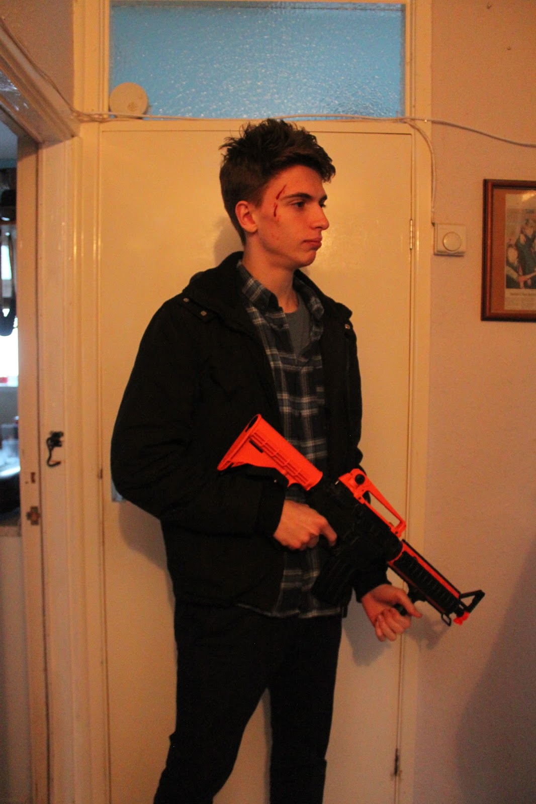
- low angle shot of Matt shooting, fade to black; 31 seconds

Editing Log- Day 1

Editing Log Day 1 - Folder Organisation


The first thing we have done is to have all shots we have taken on a dedicated storage device, which is a USB memory stick and a back up is stored on the editing computer to prevent the loss of everything we have filmed. We have many folders, all with different names to tell us what is within the specific folder, such as everything we filmed in a forest is stored in the Forest Folder. This goes the same with the multiple shots of a conversation we have in our trailer, to make a shot-reverse-shot. Another folder includes all the sound and music we plan to implement in our trailer. As we film at least 3 shots of every shot so we can have the perfect one, we make two more new folders within filming folders, one named "Use" and "Don't Use", and we look at all the shots we did and put the ones we want in our trailer in the "Use" folder and the rest in our "Don't Use" folder. With this folder structure, it allows us to easily organise ourselves when we edit, and makes us easily find the right shot we want according to our plan for the final edit.

Thursday, 11 February 2016

Music research


This is the chosen music, both copyright and royalty free we found it after many hours of filming, the music is essential in bringing the trailer into focus, we needed a song which will help bring out both the action and thriller aspects of the trailer, for this we needed music which was fast in tempo but also had parts where the music stopped in order to allow dialogue. This song was perfect, the music gradually gets quicker as it carries on, raises the tempo and at the end it ends perfectly so we can have an inception style fade our until the title and credits come up. 

The Syndicate Poster analysis


Our film is an Action/ Thriller film so our poster had to be dark and slightly mysterious. 

The white writing stands out against the black background because they are contrasting colours making the white writing bold and clear. 

The star reviews are slightly faded in to the image so that none of the image becomes distorted and doesn't look out of place. We haven't made all of the reviews five stars because that would be too much because no film ever gets all five star reviews. For example: the poster for Legend his a two star review from the Guardian between the two main characters heads. Each star review is parallel to each other so it does not look like a mess. 

On the top of the poster, we have included the name of the four main actors/actress because in movie posters they usually have the names of the actors/actresses to appeal to more audiences because a person may go to see a film just because of a person in a film. At the top, we also have references to our AS productions as people often see films from directors that they have seen before.
The production credits at the bottom of the poster are completely our own, featuring producers, actors and people who have helped with the film. Below the credits we have written 'Coming Soon' as there was no date we could agree on. A lot of films put out posters before their release with 'Coming Soon' written on them to get their audience exited and prepared for the film. 'Experience it in 3D' is also written below which a lot of films do now because it brings in a lot of profit for the film making companies.

Beside 'Coming Soon' and 'Experience it in 3D' we have the two logos of our companies, Triptic Films and Independent Film Making Studios, who have made and produces the film. It is common for movie posters to have the logos because it shows the audience who the creators were which may be a fact in why people go to see films, exactly like the Directors and Actors reasoning.

On the very bottom of the poster, there is links to the movies Facebook and Twitter pages. This is very common for films to do now because social media plays a huge part in advertising and promoting a film to all ages of viewers because most of the population are now on social media. Facebook and Twitter are the most used social medias today so it makes sense to advertise there.

The title on the poster is the title we created by ourselves, just like everything else on the poster. It was a simple white text of our title but is made to look shiny by having the slight black border to the sides of the letters.

The images featured on the poster are completely our own. Our main character is directly in the middle of the image with the love interest and the villain to the sides of the main character. The anti-hero's eyes are placed at the top of the poster to create suspense as you can only see his eyes and nothing else. The main character is in the middle of the poster because he is the lead role and he is featured in the movie the most. Having the main in the middle makes him seem like he is the most important character in the film. He is also holding a pistol, showing what weapon he uses in the film and also shows that he is in control of his situation. To the left of the main character is the love interest of the main character. It was important to include this character because she is what he is fighting for in the film as she gets kidnapped by the villain. To the right of the main character is the villain who is holding his gun in a downward position as he is anticipating an attack from the opposing side. On his face, you can clearly see two lines of red indicating that he has been injured on his face during the film, most likely by the opposing side.

Thursday, 14 January 2016

Shots for Magazine and Poster