The picture used in the poster is very inventive as it shows a house in three parts rotating to show the backwards nature of the film. The fact that the house is old means it can be used to emphasize the old fashioned way of running things, for example in the film they have a very primitive mean of keeping extraterrestrials/Gods from destroying their planet, the sacrifice technique they use shows how little humans have progressed in our search for power.
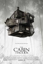 The title makes use of both large and small lettering in a convenient way. The words which stick out the most is "Cabin" which would refer to the main building where the story takes place, "woods" is next to refer to the setting around the cabin, the emptiness of the forest is there to show how little power humans actually have over their current situation.
The faded woods in the background are fazed out slightly which leads us to believe that they are mysterious. The white colouring surrounding the house can be a reference to the higher being (God) as the colour white is seen as the colour of good.
In this specific poster all the important information is highlighted in bigger bolder writing meaning the attention of the audience will be firmly on the details on which the box office profit relies.
The fact that this film is a horror film means it will appeal to an older audience probably from 15 up, the film is perfect for young teens who want a good scare with a bit of comedic relief, therefore meaning it can be good for both sexes
No comments:
Post a Comment